


Disclaimer
Polymer is in alpha. So some of the code described in this article may or may nor work properly in your browser.
For more information on current polymer compatibility status check out http://www.polymer-project.org/resources/compatibility.html
Core elements
Polymer comes with a set of neat core elements out of the box. In this article I'll take a look at some of the core elements that I am considering using on my own website. It's all about "learning by doing".
Tool tips
When ever i build a site i always at some point think about implementing tool tips. Tool tips can be useful for more than just tips. Image captions, Link information, definitions, etc, etc. Tools tips can come in handy in many situations, but for some reason i always end up forgetting about tool tips. Time to put thoughts into action and finally make tool tips happen... polymer style.
Implementing the basic polymer core tool tip is as easy as implementing any polymer element.
<link rel="import" href="components/core-tooltip/core-tooltip.html">
As with all polymer elements, once you've imported the element, it's ready to use on your site. And because web components extend HTML, you can use it just like you would use any other HTML tag. NOTE: While the
<core-tooltip>
 <span class="highlight">
  here to see my logo
 </span>
 <span tip>
  <img alt="icon" src="favicon.png" /> This is my logo!
 </span>
</core-tooltip>
Hover  This is my logo!
Using the "tip" feature, it's possible to put HTML inside the tool tip, giving you a lot of flexibility.
If you want a quicker way to just display a text message, the "label" attribute does the job. This feature could work well for image captions.
<core-tooltip label="PRO TIP: Lean forward to appear slightly less fat.">
 <img alt="me" class="fill" src="images/big_back/sitting_flemming.jpg" style="width: 300px;" />
</core-tooltip>

Core-overlay
This one is quite interesting. Again it is one of those core elements that can have multiple purposes. In it's simplest form you can toggle it on and off. When toggled on it will show the overlay as you'd expect, including its content.
In this simple example I import the element:
<link rel="import" href="components/core-overlay/core-overlay.html">
The overlay code looks like this:
<core-overlay backdrop id="overlay_1" layered>
<div style="color:white;font-size:10vw;line-height:80%">HELLO!</div>
<div style="color:white;font-size:2.57vw;"> Click anywhere to close this</div>
</core-overlay>
I use an id to toggle the build-in "toggle()" function that turns the overlay on and off. To do this i just created a simple button:
<button onclick="showMyOverlay('overlay_1');">Toggle Dialog</button>
...And a javascript function to make it go
function showMyOverlay(id){
 document.getElementById(id).toggle();
}
Making 1+1 = 3 (really fast)
As mentioned before, in polymer everything is a tag. Yes there is still javascript and CSS in the background powering each element, but the fact that all that stuff is in the background, neatly contained means that combining polymer elements such as tooltips and overlays is as easy as combining any other HTML tags.
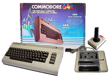
<core-overlay backdrop id="overlay_2" layered>
 <core-tooltip label="We've come a long way, baby">
  <img alt="c-64" src="blog/c64.png" />
 </core-tooltip>
</core-overlay>
click image to see an image in an overlay with a tool tip